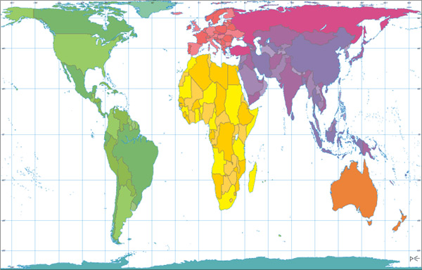
- Look at the world map taken from Google maps above. Looks familiar, right?
- Look at that huge land to North America's upper right. That's Greenland.
- Look at Africa; it seems like Africa is about the size of Greenland.
Africa is 14 times larger than Greenland.Size of Africa: 30,221,532 sq km
Size of Greenland: 2,166,086 sq km
30,221,532 / 2,166,086 = 13.95
(Data from CIA and Wikipedia)
Now look at the Google map again. What the hell is going on? Answer after the jump.
Map Projections
The world map that you and I are so familiar with is a very old cylindrical map projection, the Mercator projection, created in 1569.

Although this map serves its navigational purposes, it greatly misrepresents size relations between different areas. There is no sensible reason to use it for educational, geostatistical and thematic purposes. Not only is Africa depicted as being similar size as Greenland,
- Europe seems to be larger than South America when South America is actually almost twice the size of Europe.
- Alaska appears to be three times larger than Mexico, although Mexico actually is larger than Alaska.
- Russia seems to be larger than Africa when the opposite is true in reality
- The Northern Hemisphere is enlarged significantly making Europe appears to be larger and center of the map.
While it is impossible to create an absolutely accurate map by flattening out the Earth’s land masses, there are projections that do a MUCH better job of displaying the true size relations between land masses.

The CIA uses the Robinson projection.

National Geographic uses the Winkel tripel projection.
In 1973, Arno Peters introduced the Gall–Peters projection (first appeared in 1855) and promoted it as much more realistic perception of the world than the Mercator projection. It's a equal-area cylindric projection and "all areas, both land and water, are of relatively proportional size: one square inch anywhere on the map represents 158,000 square miles on the Earth’s surface." It would be better suited for educational purposes comparing to the Mercator projection because of its realistic portrayal of proportion.
Although the Gall-Peters projection portrayed a more realistic view of the Earth, map publishers didn't see the need to replace the Mercator projection because of its popularity. People feel more familiar and comfortable with the Mercator projection; it remains to be a popular choice for schools, wall maps and popular illustration.
Why is Google Maps using the Mercator projection?
Many people had the same urge as me to ask this question.
The Mercator Projection distorts the world, giving the false impression that Greenland is the size of South America, Asia is ginormous and Alaska is bigger than Mexico - all inaccuracies that are being presented by Google. Google's reputation for accuracy means that these distortions are reinforced in our conscience as facts.
The Mercator Projection is 440 years old and provided one practical purpose - bearings can be accurately drawn. The utility of this begins and ends with nautical navigation - clearly not the primary purpose of Google maps.
And this,I urge Google to be responsible with the world's knowledge and follow the advice of numerous cartographic associations that request that the Mercator Project not be used. For anything. Ever.
A Google employee's response:if you zoom out of any google map you will notice a huge difference in sizes and incredible inaccuracies for example, according to google maps Greenland is bigger than South America. and Antartica looks like its the size of North America, South America, Europe, Africa, and Asia combined. Why would Google start off with the most outdated map known as Mercator's Map of the 18th century and not go with the most accurate map out there known as the Cahill-Keyes map made in 1975
The world deserves to know what the world really looks like rather than a distorted perception of the world.
Thanks for the feedback. Maps uses Mercator because it preserves angles. The first launch of Maps actually did not use Mercator, and streets in high latitude places like Stockholm did not meet at right angles on the map the way they do in reality. While this distorts a 'zoomed-out view' of the map, it allows close-ups (street level) to appear more like reality. The majority of our users are looking down at the street level for businesses, directions, etc... so we're sticking with this projection for now. In the meantime, you might want to look at our favorite 3D view of the world.Okay, so the Winkel tripel projection doesn't work because of the angles; but what about the Gall-Peters projection?
So...
Different map projections serve different purposes and all of them have distortion of some kind. However, the distortions in the Mercator projection are pretty ridiculous considering its popularity. I see parallels between the Mercator Map and our old common senses. Even when we know they're bull, we continue to use them and teach them to our children for our own comfort. Maybe we should try sticking this on the wall for a change:

Of course, the most accurate world map is a globe. You could see it at http://earth.google.com/.
At last, I'll leave you with this video clip from The West Wing:
Related Links:
Map Projections: Preserving Areas
A More Realistic View of Our World
Evolution of the Dymaxion Map: An Illustrated Tour and Critique
Why does Google maps use the inaccurate, ancient and distorted Mercator Projection?
Why is google maps using the wrong base map?
Arno Peters: Radical Map, Remarkable Man TRAILER (Youtube)
LOL, nice. Yea ive actually noticed that some maps do infact make the northern hemisphere seem bigger than it really is. Stupid google.
ReplyDeletenice post! did you actually email google that question?
ReplyDeletei think extra credit points loom in your future :)
No cartographer in their right mind has ever said "[the mercator projection] should never be used. for anything. ever."
ReplyDeleteIt is merely the misuse of a purely functional navigational tool as an educational device which they have protested.
This is however a moot issue concerning google maps because...
google maps uses the mercator projection for the same reason that navigators use the mercator projection...
I.E. that google maps is primarily a navigational tool, and not a geo-political statement.
Pros:
It is conformal (preserves angles), which means that the shape of objects is preserved.
It is rectangular & uninterrupted, which allows the computer to tile the map for scaling purposes.
Zooming in reduces the distortion, a 40km wide map has exactly 1/1000 the distortion of the 40,000km wide full earth map
Cons:
The scale of the map increases as you move away from the equator.
The gall-peters AKA the 45 degree equal area cylindrical projection. It is equal area and rectangular, but it does not preserve angles. Shapes distort as you move away from 45 degrees north and 45 degrees south.
It has EXACTLY the same amount of distortion as, all other cylindrical projections, including the mercator projection, AND is also nearly useless as a navigational aid.
The robinson and winkel projections are purely cosmetic. they distort both shape and size, and cannot be tiled. This makes them useless for everything except being pretty to look at.
The least distorted conformal map of the whole planet that I can think of is the Peirce quincuncial projection. However it is unsuitable for the purposes of google maps because it is radial and thus is not compatible with the google maps display.
The conformal conic projection is probably the best for navigation, but can only represent a small area.
Seems like the author is more interested in making some sort of hollow political point about Eurocentrism than google is, as he took the most practical map (for computer purposes) and said that they should be using two or three of the least practical maps for the same purpose. As for education, many classrooms nowadays use some form of the Goode homolosine projection because of the distortion of Mercator. I went to school in the 90s and even then we had an entire elementary class on map distortions and projections, and why we put the Goode projection on the wall instead of Mercator(I remember the teacher taking an orange and flattening the peel on the table to show how difficult it was to make a spherical globe into a flat map.) While the points in the article are factually valid, the inflammatory language used here and thinly-veiled conspiracy theorizing are ironically more subversive to the reader than any usage of the Mercator projection.
ReplyDeleteAnother thing I forgot to mention, this whole problem is going to cease in the next 20 years anyway, as we now have the technology to project spherical images on flat surfaces with exact accuracy using computers and applications like Google Earth, allowing each student to carry a globe with them at all times for geography, while learning flat maps simply for navigational purposes.
ReplyDeleteIf you had realised the mercator is used in google earth as WELL!!!
DeleteThis comment has been removed by the author.
Deletewow this is actually an amazing post and i cant beleive that the map most used makes greenland look bigger than africa when africa is actually 14 times bigger.
ReplyDeleteif i were to use a map that was flat i would probably use the winkel tripel projection.
hello dherek
ReplyDeleteyour face is niiiiiicccceee
i know where you live
jk
i dont
but ifthere is a kid outtherenamed dherek than i trolled you hard
so dherek did you read it
ReplyDeleteya
Deletewhat country makes you the horniest
ReplyDeleteur moms
Delete☻/ This is bob. Copy and paste him so he can take over youtube.
ReplyDelete/▌
/\
INTERESTING I LEARNT ALLOT FROM THIS
ReplyDelete█████]▄▄▄▄▄
ReplyDelete▂▄▅█████████▅▄▃
Il██████████████|)
◥⊙▲⊙▲⊙▲⊙▲⊙▲⊙▲⊙◤.. /
Help BoB Get rid of google+
☻
/▌\
/ \
every country has inferior potassium outputs to Kazakstan
ReplyDeleteespecially Uzbekastan
Its Khyle Jhon
ReplyDeleteThe Earth is Flat. Do your homework. EDUCATE YOURSELF. ERIC DUBAY 200 PROOFS EARTH IS NOT A GLOBE.
ReplyDeleteThank you for your post. This is excellent information. It is amazing and wonderful to visit your site.
ReplyDeleteBuy Flat Earth Map
"The Northern Hemisphere is enlarged significantly making Europe appears to be larger and center of the map."
ReplyDeleteUh... the Southern Hemisphere is also enlarged by the same amount at the same latitudes and is exactly the same size as the Northern Hemisphere. This is clearly illustrated with Tissot's indicatrices https://en.wikipedia.org/wiki/Tissot's_indicatrix added to the graticule line intersections at standard intervals. Also see http://geokov.com/education/map-projection.aspx for an expanded discussion of the various types of projections including pros and cons.
The main reason Europe looks larger than the Southern Hemisphere occupied land masses is that Europe is farther from the equator and therefore has greater enlargement.
The fact that Europe is also close to the center of the map is due partially to British-centrism inherent to the establishment of the 0° "Greenwich" meridian for longitude by Sir George Airy in 1851 and accepted as the international prime meridian by a 25-nation conference in 1884 https://en.wikipedia.org/wiki/Prime_meridian_(Greenwich). Putting this 0° meridian in the center of the map means the negative latitude angles are on the left half and the positive on the right. Given the arrangement of the continents withing this graticule definition and the focus of most North American/European map-makers being land masses, this arrangement also keeps all of the occupied continents intact while splitting the Pacific Ocean. Some Eastern Asian map makers split the Atlantic Ocean instead with this projection.
The official source for NFL news, video highlights, fantasy football, game-day coverage, schedules, stats, scores and more. Vikings football
ReplyDelete